Coloring tips: How to color Fruit Shop Window Fruit coloring page well?
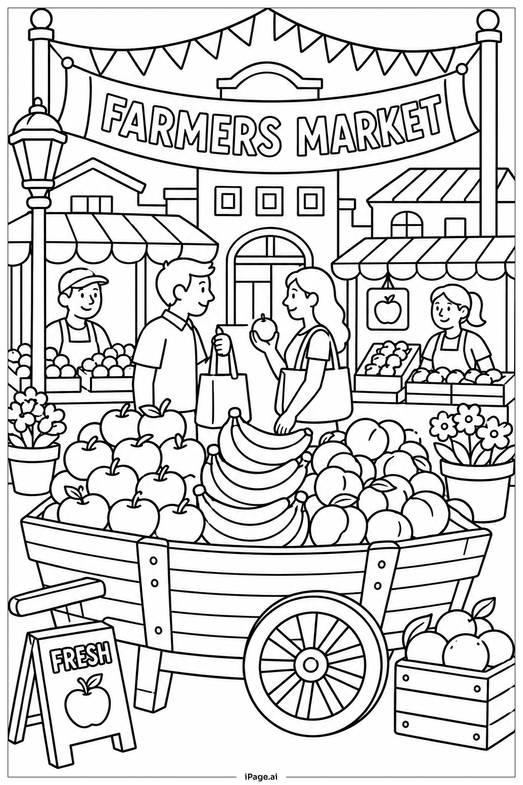
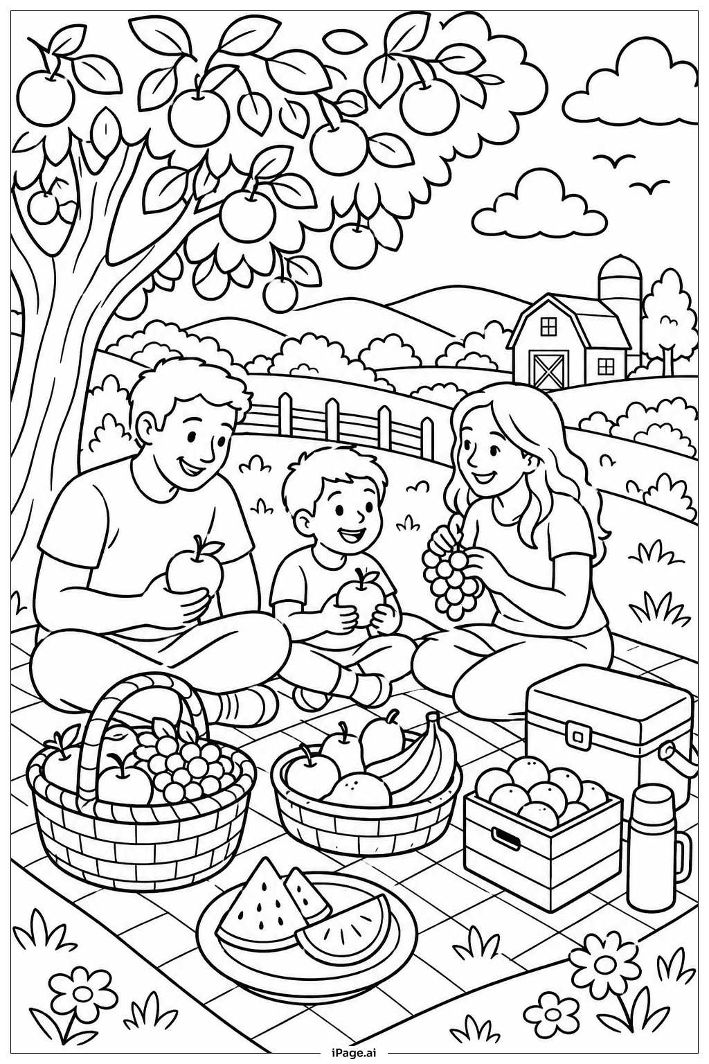
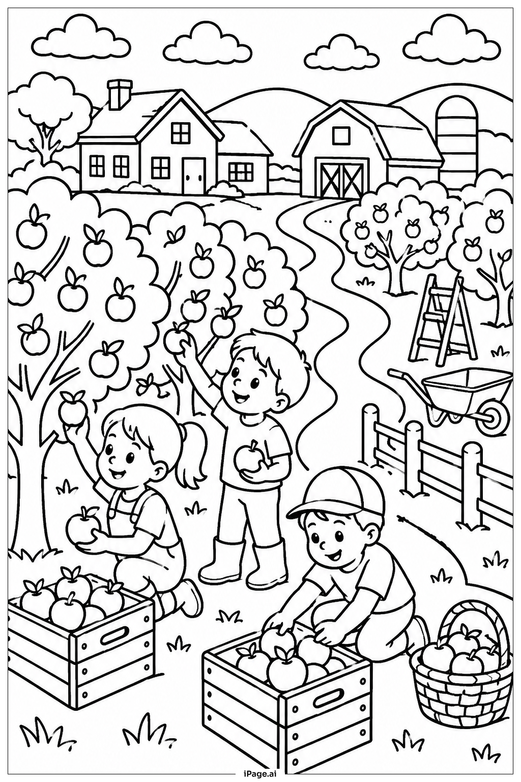
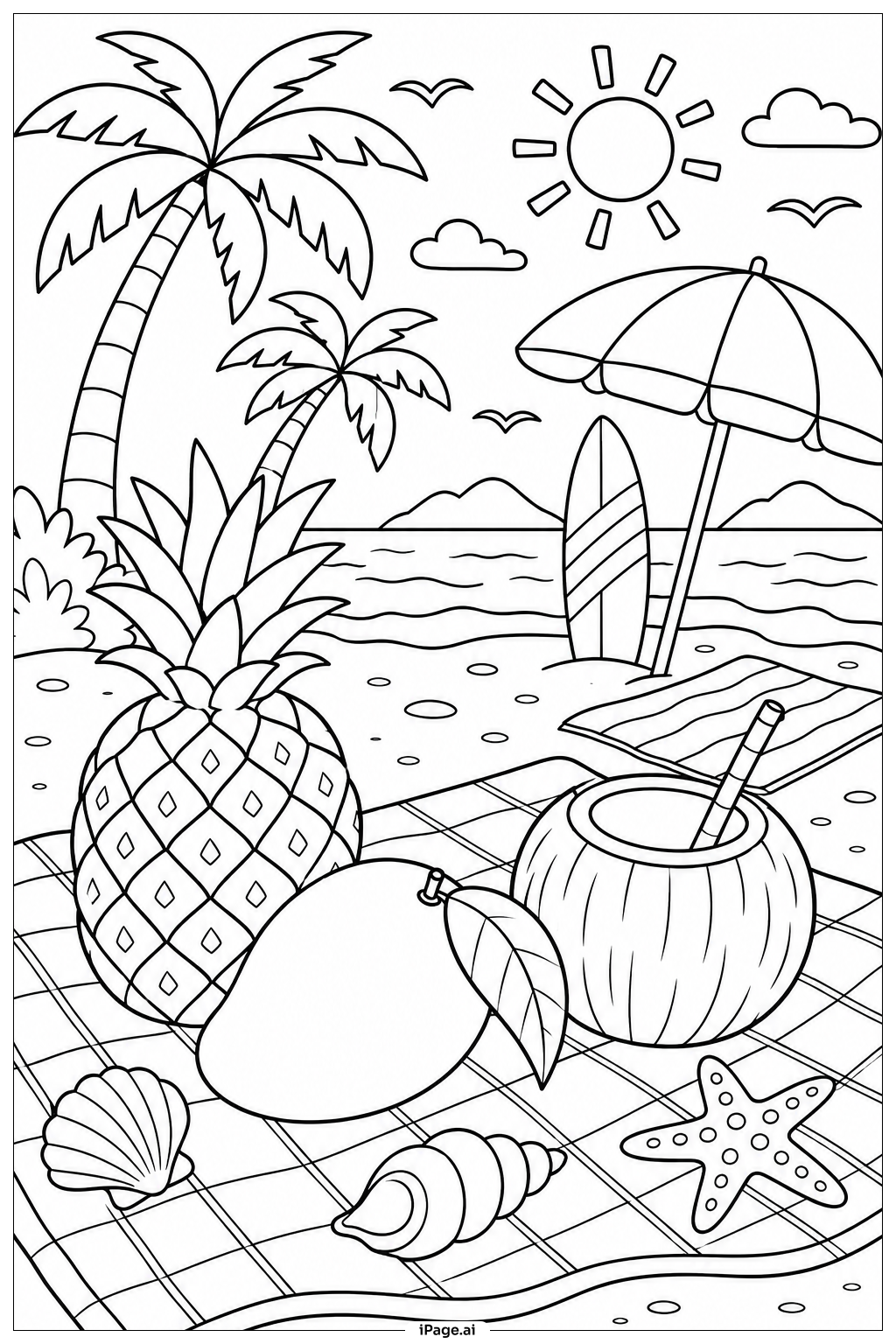
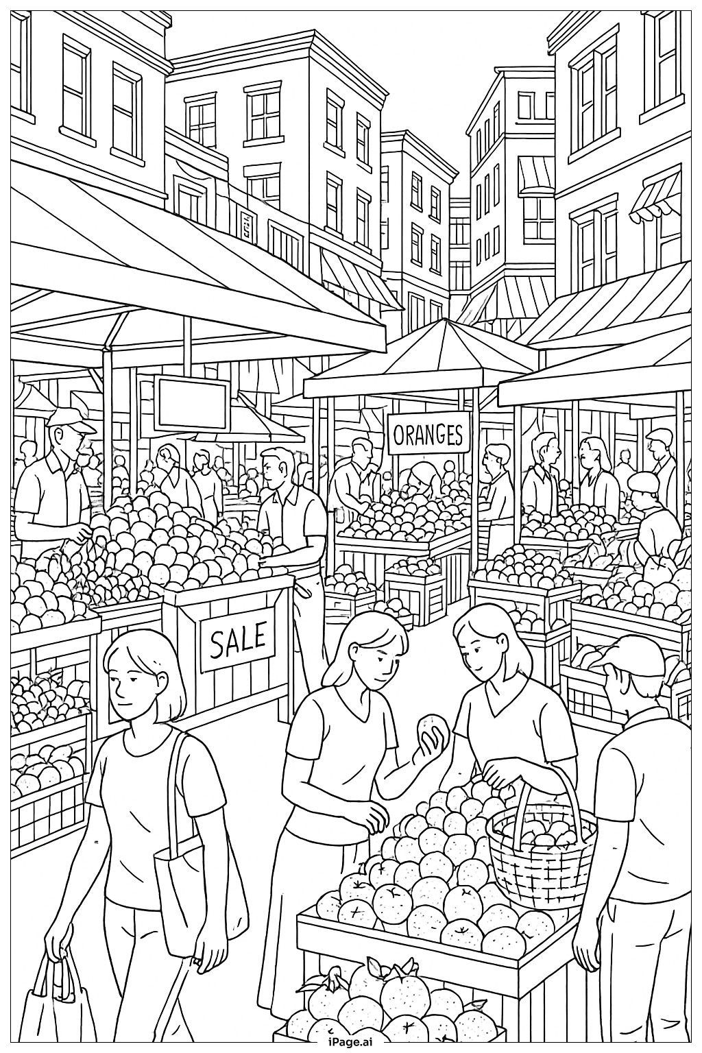
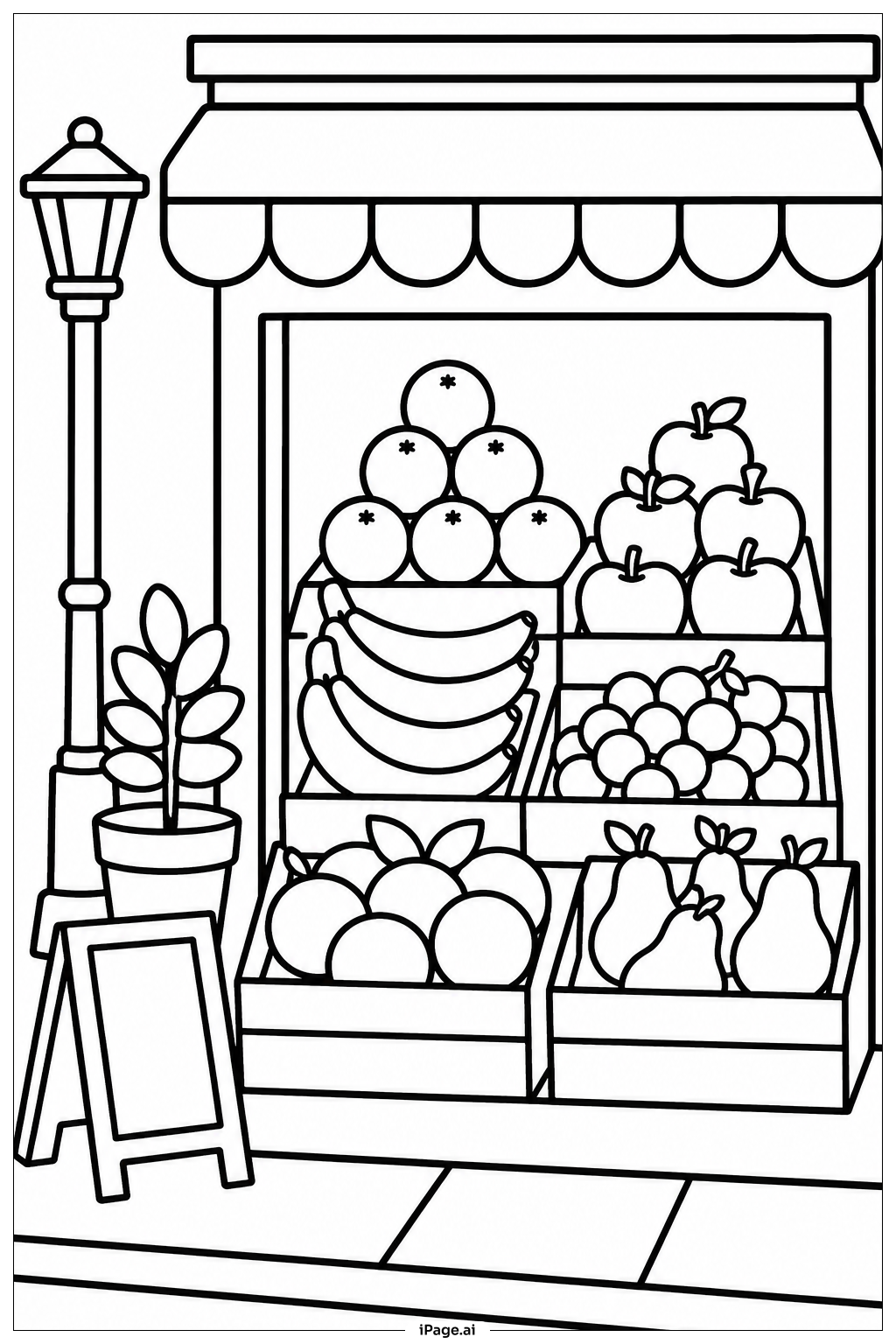
Start with the lightest fruits first. Color bananas a warm yellow and add a hint of green at the tips. Use bright red or deep crimson for apples and strawberries. Oranges look great in a rich orange tone with a slightly darker shade for texture. Grapes can be purple, red, or even green — try a gradient from light to dark to make them look round and juicy. Pineapples work well with golden yellow for the body and fresh green for the leafy crown. For the watermelon, use bright red on the inside and soft green on the rind. The shop window frame can be colored in warm browns or muted tones to let the colorful fruits stand out. Encourage mixing shades and adding small highlights in white or light yellow to make each fruit look shiny and three-dimensional. Have fun experimenting with color combinations!
Coloring challenges: Which parts are difficult to color and need attention for Fruit Shop Window Fruit coloring page?
• Overlapping Fruits: Many fruits in this image overlap and crowd together in the display. Keeping each fruit's colors separate without accidentally blending into a neighboring fruit requires careful attention. Using fine-tipped colored pencils or markers for the border areas between fruits will help keep each one clean and distinct.
• Round and Curved Shading: Fruits like apples, oranges, and grapes have smooth, rounded surfaces. Capturing that three-dimensional roundness with flat coloring tools is tricky. Try coloring in circular strokes and leaving a small bright spot near the top of each fruit to suggest a light reflection and give a sense of depth.
• Small and Detailed Areas: Strawberry seeds, grape stems, pineapple scale patterns, and banana ridges are all tiny, intricate details. Coloring inside these small spaces without going over the lines demands steady hands and patient, precise strokes. Sharpened pencils or fine-liner markers are best for these sections.
• Balancing Color Variety: With so many different fruits packed into one scene, choosing colors that are all vibrant but still harmonious is a real challenge. If too many bright colors sit next to each other, the image can look chaotic. Try alternating warm and cool tones throughout the display to create visual balance.
• The Shop Window Frame: The frame around the fruit display needs to be colored in a way that complements but does not compete with the fruits inside. Choosing a neutral tone like tan, brown, or soft gray for the frame ensures the colorful fruits remain the focal point of the whole scene.
Benefits of coloring books: Advantages of drawing Fruit Shop Window Fruit coloring page
Coloring this Fruit Shop Window Fruit page offers a wonderful range of benefits for children and young learners. First, it helps kids recognize and name different types of fruits, turning the activity into a fun, hands-on learning experience about healthy foods. Choosing colors for each fruit sharpens color recognition skills and encourages children to connect colors with the natural world around them. The variety of shapes — round oranges, curved bananas, elongated pineapples — supports the development of shape recognition and spatial awareness. Working carefully within the detailed lines of the image builds fine motor skills and hand-eye coordination, which are essential for writing and other daily tasks. Focusing on a detailed and busy scene like a fruit shop display also trains concentration and patience, helping children practice staying on task. On an emotional level, the vibrant, cheerful nature of a fruit market scene creates a positive and joyful coloring experience. It can spark creativity as children decide on their own color combinations and personalize their artwork. For older kids, the shading challenges encourage more advanced artistic thinking. Overall, this coloring page is both educational and entertaining — a great way to blend creativity with learning about nutrition and the natural world.