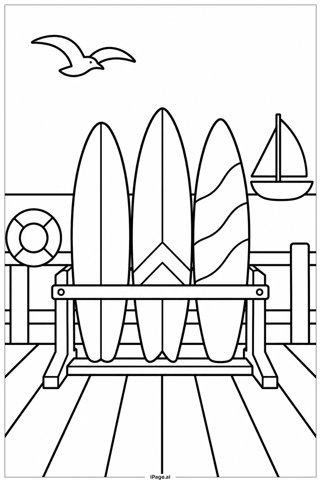
Coloring tips: How to color Surfboard Rack At Pier coloring page well?
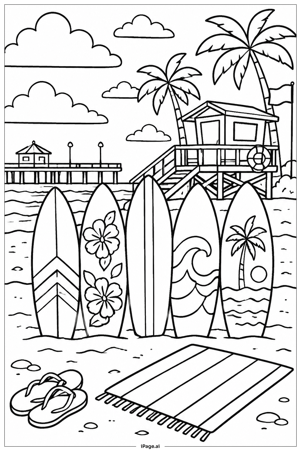
Start with the ocean and sky in the background. Use light blue or turquoise for the water and a soft blue or pale yellow for the sky. Add white tips to the waves for a realistic touch. Color the pier planks in warm tan or medium brown tones to show aged wood. For the surfboard rack, use a darker brown or gray. Make each surfboard a different, bold color — try red, yellow, orange, green, or bright blue. You can add stripes, swirls, or patterns to each board to make them stand out. Use sandy beige for any beach areas. Keep the overall palette bright and cheerful to capture the fun, sunny mood of a beach day.
Coloring challenges: Which parts are difficult to color and need attention for Surfboard Rack At Pier coloring page?
• **Multiple Surfboards with Small Details:** Each surfboard has its own shape, fin placement, and edge lines. Staying inside the narrow outlines without smudging neighboring boards can be tricky, especially where the boards overlap or lean close together. Younger colorists may need fine-tip markers or sharpened colored pencils for these tight areas.
• **Wood Grain Texture on the Pier and Rack:** The pier planks and the wooden rack both call for realistic wood tones. Blending two or three shades of brown to suggest grain and depth takes patience and layering skill. Flat, single-color application can make the wood look stiff, so building up light strokes gradually gives a more natural result.
• **Water and Wave Details:** The ocean beneath the pier involves gentle gradients — deeper blue farther out, lighter near the surface, with white foam on wave crests. Achieving a smooth color transition without harsh lines requires careful blending, which can challenge beginners unfamiliar with gradient techniques.
• **Background Depth and Perspective:** The pier creates a sense of depth and distance. Keeping the background lighter and less detailed while making the foreground richer and more saturated helps sell the perspective. Balancing these tonal differences is a subtle skill that requires planning before the first stroke of color.
• **Consistent Color Theme Across the Scene:** With so many elements — boards, rack, pier, sky, and sea — maintaining a harmonious color palette across the whole image can be difficult. Choosing colors that complement rather than clash with each other, especially across the vivid surfboards, requires a bit of color theory awareness.
Benefits of coloring books: Advantages of drawing Surfboard Rack At Pier coloring page
Coloring this Surfboard Rack At Pier scene offers a wide range of benefits for kids and teens alike. The variety of surfboards encourages creative thinking, since each board is a blank canvas for unique patterns, stripes, and color choices. This kind of open-ended decision-making builds confidence and artistic expression from an early age.
Working on the wood textures of the pier and rack helps develop fine motor skills, as applying careful, controlled strokes trains hand steadiness and pencil grip. Coloring the ocean and sky introduces basic concepts of color blending and gradient, which lays a natural foundation for understanding art and design.
The beach and surf theme is exciting and positive. It sparks curiosity about the ocean, surfing, and outdoor life. Children who engage with scenes from nature and real-world activities tend to develop a broader sense of the world around them.
Focused coloring also promotes mindfulness. Sitting quietly and working through a detailed scene helps children manage attention and practice patience — skills that carry over into schoolwork and daily life. Overall, this image combines fun, creativity, skill-building, and calm focus into one rewarding coloring experience.