Coloring tips: How to color Rose On Pedestal coloring page well?
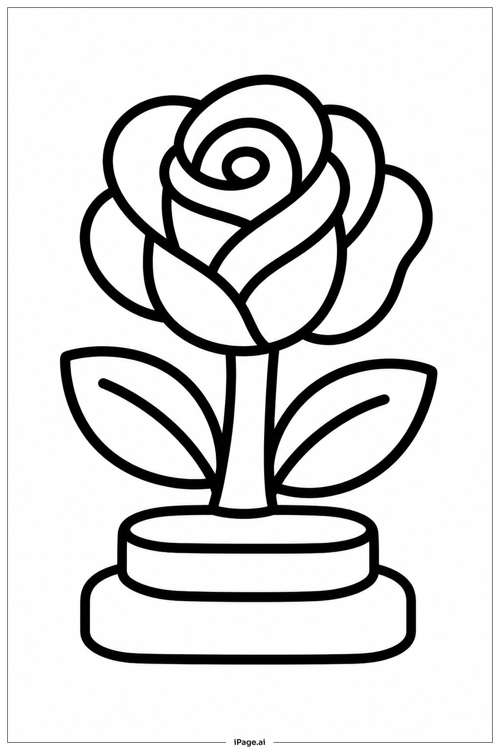
Start with the rose petals. Use deep red or pink at the outer edges and lighten toward the center with soft pink or white. This creates a natural, three-dimensional look. For the leaves, use two or three shades of green. Darker green on the outer edges and lighter green closer to the center veins works well. Try yellow-green for a fresh, lively feel. Color the stem with a medium green and add small touches of brown for texture. For the pedestal, you can go classic with gray or beige tones to give it a stone-like appearance. You could also try gold or cream for a more royal look. Use light and dark shading along the pedestal edges to show depth. If you want a dramatic effect, try a dark background like deep purple or navy blue. This will make the rose and pedestal stand out beautifully. Take your time with each section and enjoy the process!
Coloring challenges: Which parts are difficult to color and need attention for Rose On Pedestal coloring page?
• Petal Layering and Shading: The rose has many overlapping petals that curl and fold in different directions. Coloring each petal individually while keeping smooth transitions between light and shadow can be tricky. You need to decide where the light source is coming from and stay consistent throughout all the petals to make the rose look realistic and full.
• Tiny Leaf Details: The leaves have thin veins running through them. Coloring around these fine lines without smudging or going outside the lines requires a steady hand and a sharp colored pencil or a fine-tip marker. Keeping each side of the vein slightly different in shade adds depth but takes careful attention.
• Pedestal Ornamental Details: The pedestal features decorative patterns and carved-looking details along its surface. These small design elements need precise coloring to stand out. Using two or more shades of the same color helps create a three-dimensional effect, but staying within the tiny detailed sections can be challenging, especially for younger colorists.
• Stem Texture and Transition: The stem connects the rose bloom to the pedestal and needs to transition naturally in color. Blending the green of the stem smoothly so it does not look flat requires gentle layering. Adding small hints of brown or darker green along one side helps it look round and realistic.
• Overall Color Harmony: Choosing colors that work well together across the entire image, from the petals to the leaves to the pedestal, is its own challenge. Making sure no single section looks too bright or too dull compared to the rest takes practice and a thoughtful eye for balance.
Benefits of coloring books: Advantages of drawing Rose On Pedestal coloring page
Coloring this Rose On Pedestal image brings many wonderful benefits for kids and adults alike. For younger colorists, it helps build fine motor skills as they practice staying within the lines of the petals, leaves, and pedestal details. This kind of careful, focused work also strengthens hand-eye coordination over time. Choosing colors for the rose, leaves, and pedestal encourages creative thinking and self-expression. Kids get to experiment with different color combinations and develop their own artistic style. For older children and adults, the detailed nature of this image makes it a great mindfulness activity. Focusing on each petal and shading technique helps calm the mind and reduce stress. It brings a quiet, meditative feeling that is both relaxing and satisfying. The image also introduces basic concepts of art and design, such as shading, color blending, and visual balance. Completing the full image builds a sense of pride and accomplishment. Whether you are a beginner or more experienced, this Rose On Pedestal coloring page offers a rewarding and enjoyable creative experience for everyone.