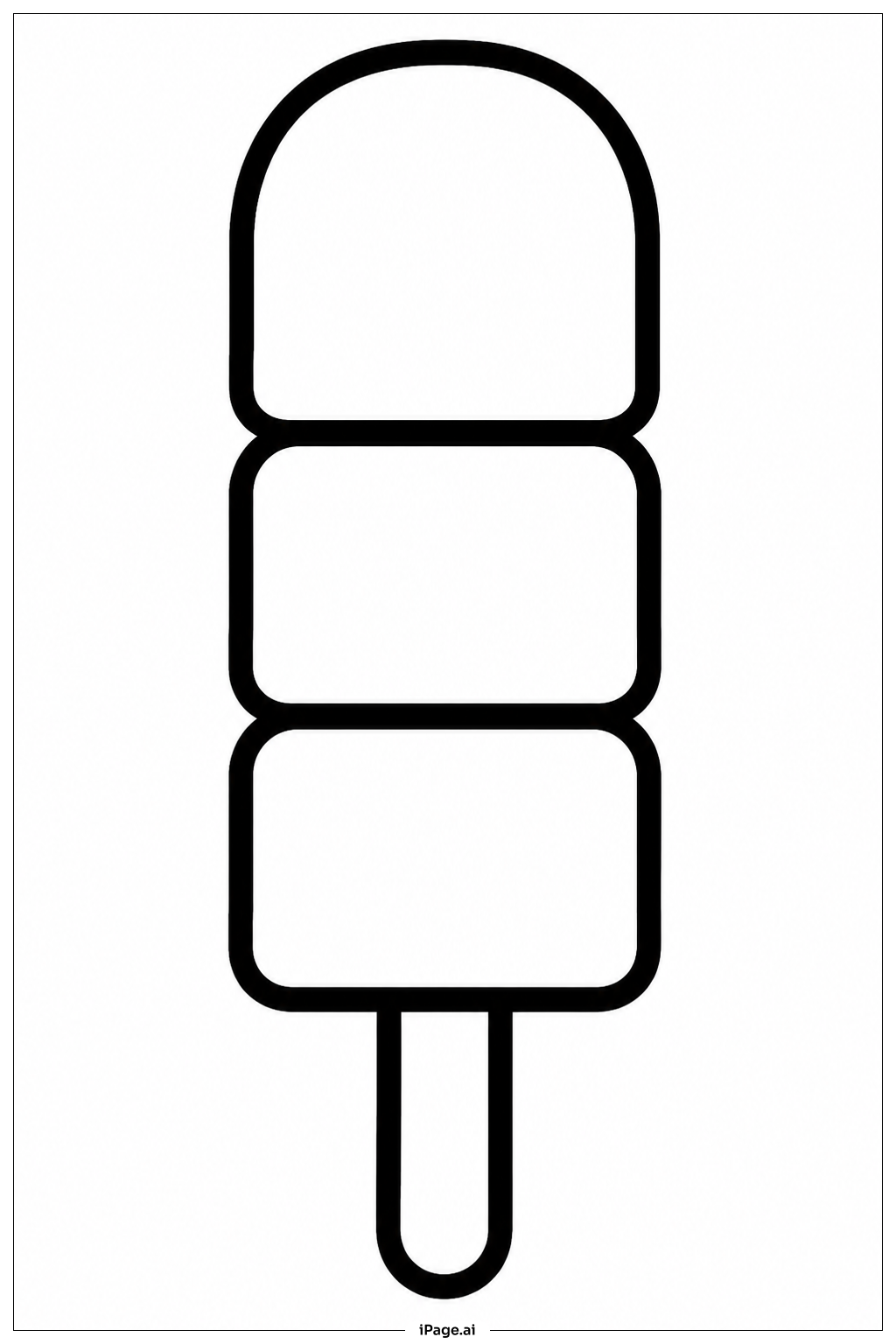
Coloring tips: How to color Stacked Popsicle Trio coloring page well?
Try using bright and happy colors like reds, oranges, yellows, and pinks to bring these popsicles to life. You could color each popsicle in a different flavor theme, for example, strawberry red for the top, mango orange for the middle, and lemon yellow for the bottom. Adding small colorful dots or stripes can make the popsicles look extra fun and yummy. You can use light brown or beige for the wooden sticks to give them a natural look. Don’t be afraid to mix colors or add a little shading with darker and lighter tones to show shine or texture. This is your chance to be creative and make each popsicle look delicious and cool!
Coloring challenges: Which parts are difficult to color and need attention for Stacked Popsicle Trio coloring page?
• Stacking Detail: Coloring the popsicles stacked on top of each other requires careful attention to keep their edges distinct without blending colors accidentally, which can be tricky for younger children.
• Texture Lines: The subtle texture lines on the popsicles need gentle coloring to highlight the icy surface without making the design look messy or scribbled.
• Small Stick Area: The wooden sticks are narrow and require precision, so coloring inside the lines here offers a good fine motor skill challenge.
• Keeping Clean Edges: Because the popsicles are closely stacked, it can be hard to color cleanly along the edges without mixing colors between them.
• Color Choice Balance: Choosing harmonious colors that contrast well so the popsicles remain visually distinct but still look natural might be a thoughtful task for middle-grade colorists.
Benefits of coloring books: Advantages of drawing Stacked Popsicle Trio coloring page
Coloring this Stacked Popsicle Trio encourages creativity and imagination by allowing children to experiment with different color combinations. It helps improve fine motor skills, especially when coloring small details like the sticks and texture lines. The challenge of staying within the popsicle shapes aids in developing hand-eye coordination and concentration. Additionally, coloring stacked objects helps children understand spatial relationships as they visually separate and organize the overlapping forms. This activity can also boost mood and relaxation while fostering a sense of accomplishment once the coloring is complete.