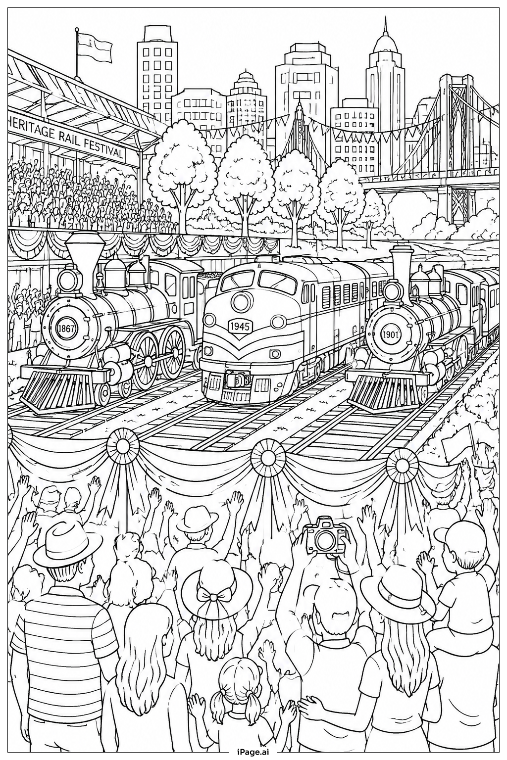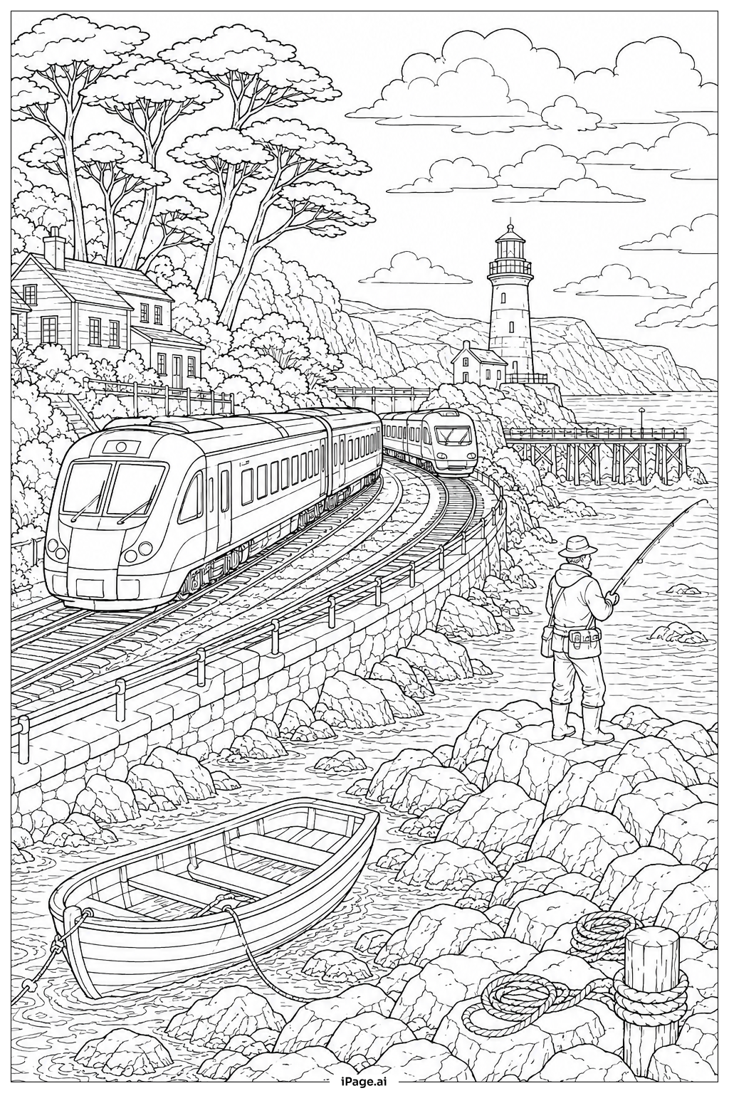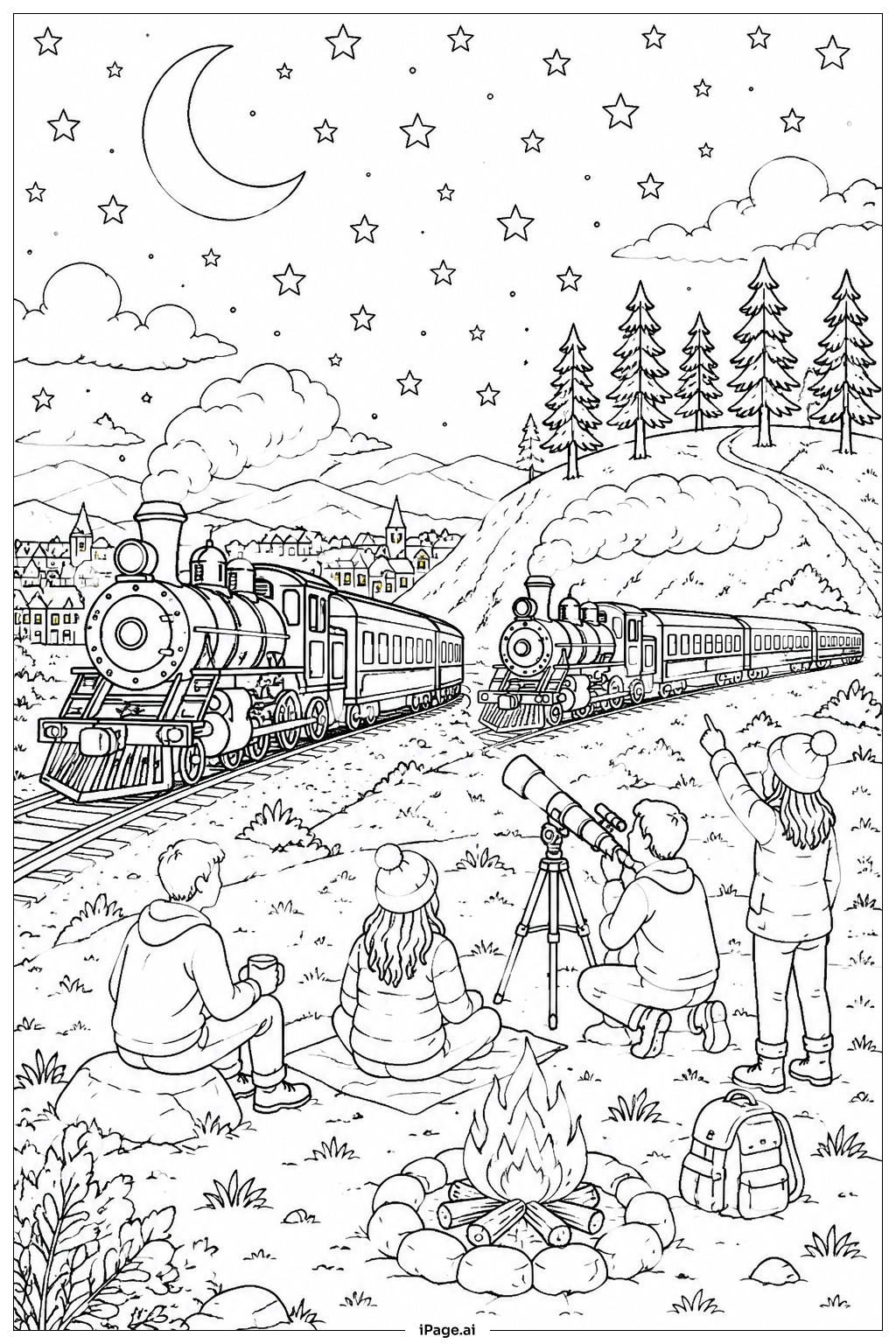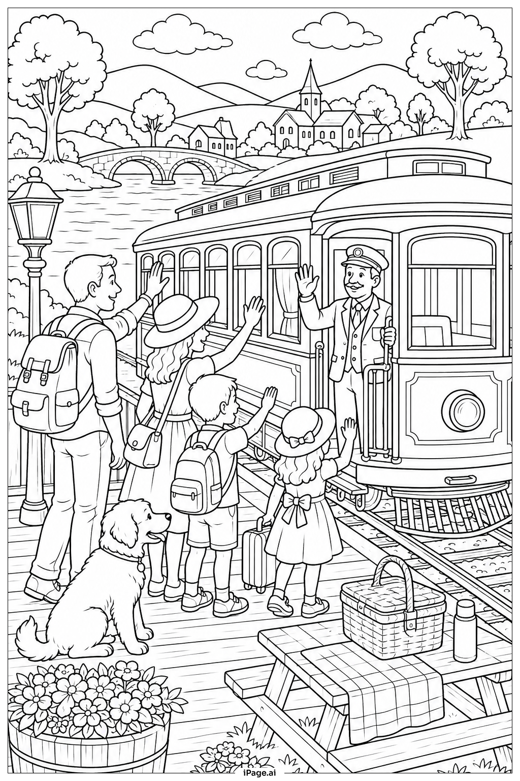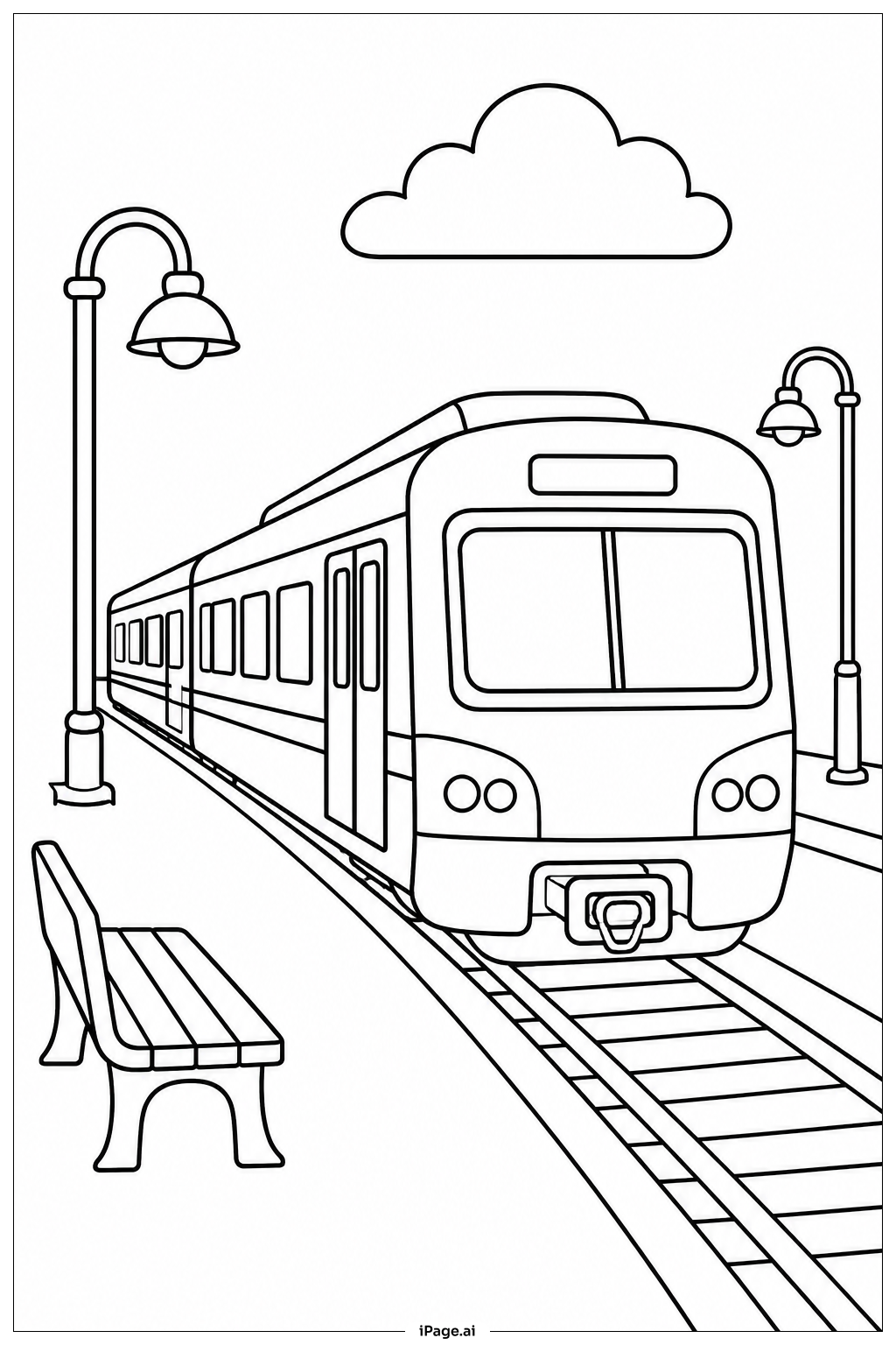
Coloring tips: How to color Commuter Train At Station coloring page well?
Start with the train body and pick a bold, solid color like silver, blue, or red to make it stand out. Use a slightly darker shade along the bottom edge to show depth. Color the windows with light blue or gray to give a glassy look. For the platform, use light gray or tan for the tiles and brown or dark gray for the railings and supports. The overhead canopy can be a warm beige or white. Paint the lampposts in black or dark gray. Use soft greens for any trees or bushes in the background. Distant buildings can be colored in muted shades like light blue, cream, or pale yellow so they stay in the background. Try to use darker shades near edges and lighter tones in the center of flat areas to add a sense of light and shadow. Have fun mixing colors to make the scene feel lively and full of energy.
Coloring challenges: Which parts are difficult to color and need attention for Commuter Train At Station coloring page?
• Train Body Paneling: The train has long, flat panels running along its sides. Keeping the color even across such large areas without streaks or gaps can be tricky, especially when using colored pencils. Try coloring in one direction with steady, light pressure and build up layers gradually for a smooth finish.
• Window Details: The train and station both have many windows of different sizes. Each window needs a consistent, light color to look glassy and realistic. Staying neatly inside the window frames without going over the lines takes careful control, especially in the smaller panes.
• Platform Tile Patterns: The station floor features repeated tile or grid patterns. Coloring each tile consistently while keeping the overall floor looking flat and uniform requires patience. Using a single base color and adding very light shading in alternating tiles can help create a natural look.
• Structural Metal Elements: Railings, canopy supports, and lamppost details are thin and closely spaced. These narrow areas are hard to color without accidentally filling in the white gaps between them. A fine-tip marker or a well-sharpened pencil works best for these sections.
• Background Depth and Perspective: The scene includes layers of depth — the platform, the train, and the city background. Choosing the right color values so that the foreground looks closer and the background looks farther away takes planning. Using lighter, less saturated colors in the back and stronger colors up front helps create a convincing sense of distance.
Benefits of coloring books: Advantages of drawing Commuter Train At Station coloring page
Coloring this commuter train scene offers a wide range of benefits for children and young learners. Working on the train's long panels and detailed station structures helps build fine motor skills and steady hand control. Staying within the lines of small windows and narrow railings trains focus and patience, which carry over into school and everyday tasks.
Choosing colors for the train, platform, and background also sparks creative thinking. Kids learn to make decisions about color combinations and how light and shadow work together. This builds early visual and artistic understanding in a fun, low-pressure way.
The urban setting introduces children to real-world concepts like public transportation, city life, and how train stations are organized. It gently expands their understanding of the world around them while they enjoy a hands-on activity.
Coloring is also a calming and relaxing experience. It helps reduce stress and gives children a healthy way to unwind after school. Finishing the full scene gives a strong sense of accomplishment and builds confidence. Whether done alone or with family, this coloring page is a rewarding activity that combines creativity, learning, and fun all in one.