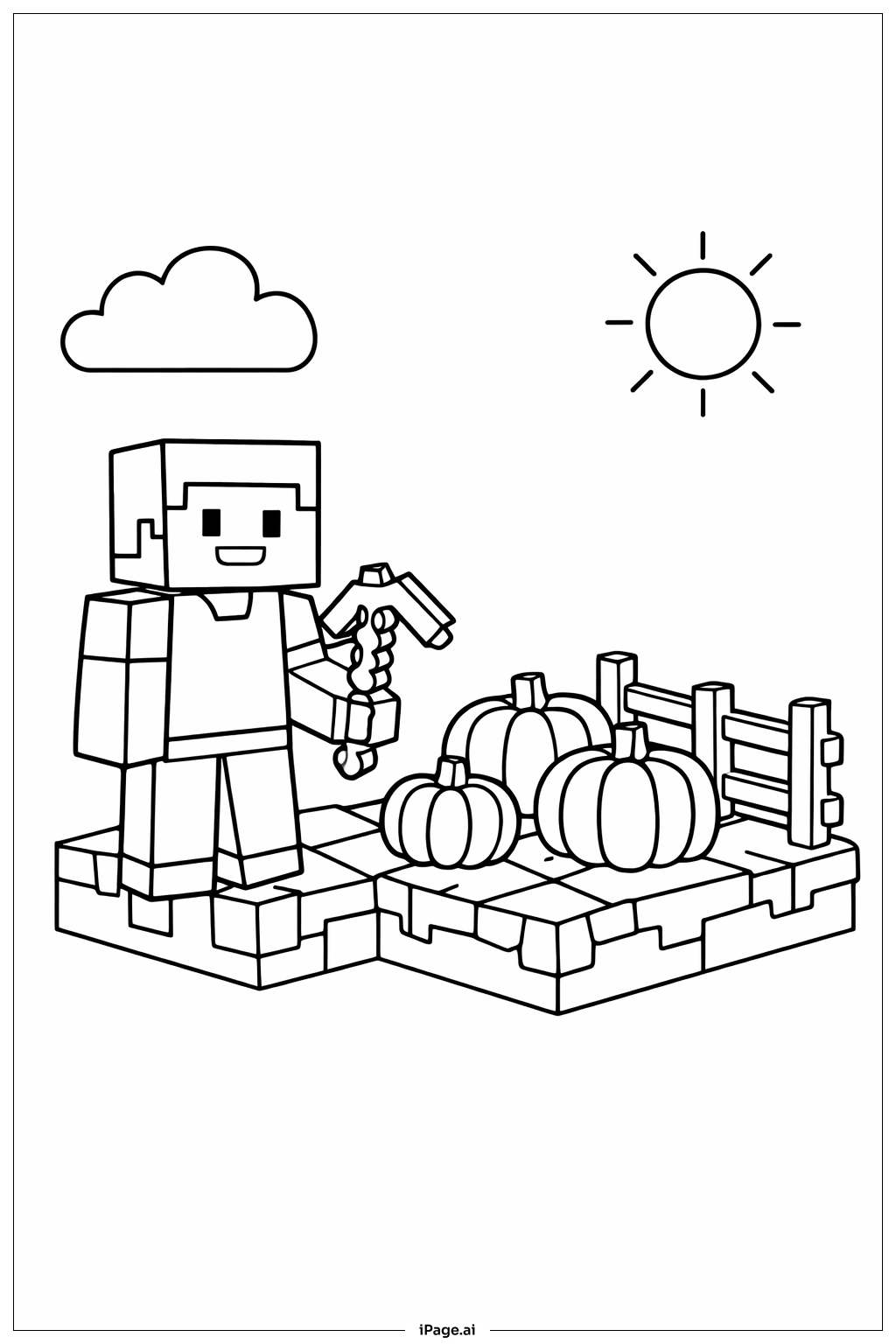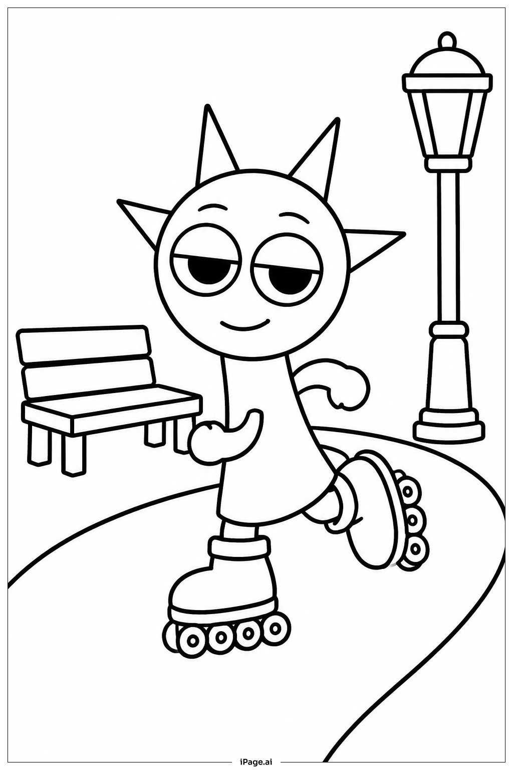
Coloring tips: How to color Sprunki Roller Park coloring page well?
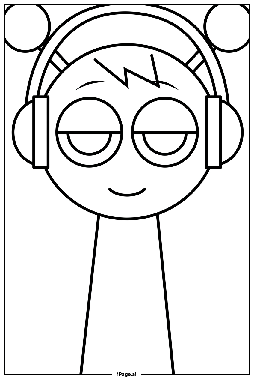
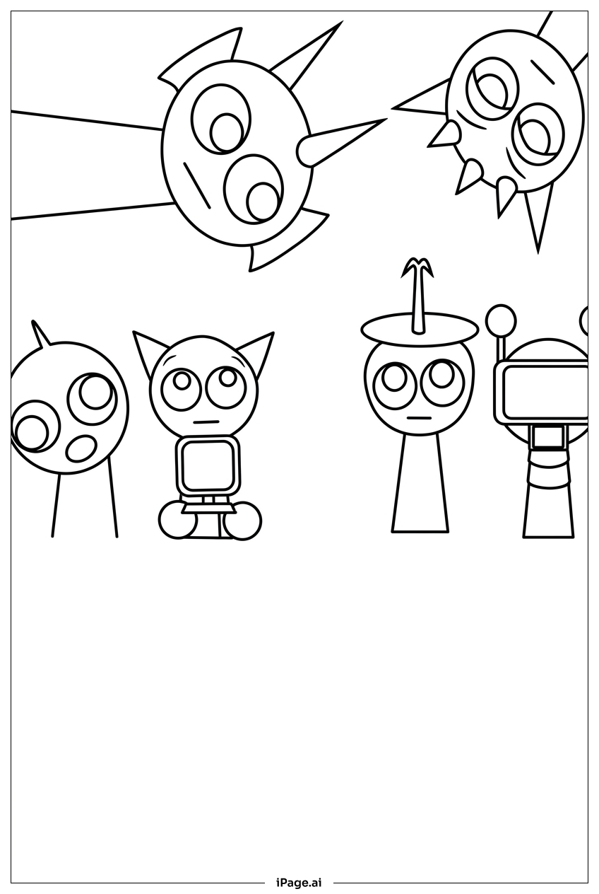
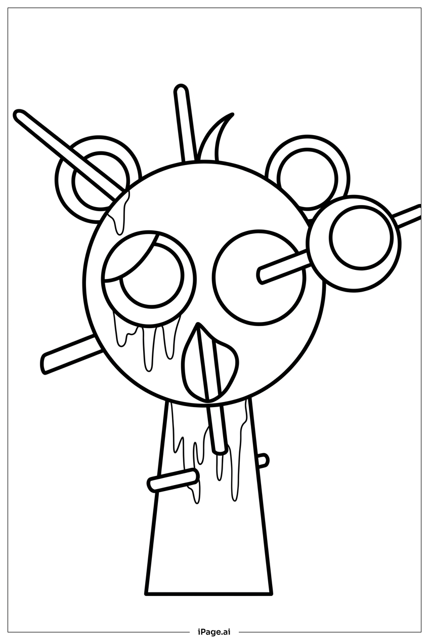
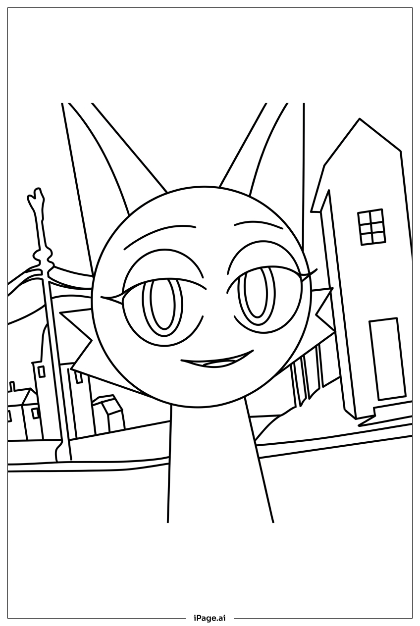
Start with the Sprunki characters and give each one a unique color scheme so they stand out from each other. Use bright, bold colors like orange, purple, teal, and yellow for their outfits and roller skates to bring out the fun energy of the scene. For the rink surface, try a cool light blue or soft gray to show a smooth skating area. The background park structures look great in warm colors like red, orange, and green. Use darker shades to add depth to shadows under the characters and along the edges of the rink. Keep the sky or upper background light, like pale blue or lavender, so the characters pop. Little details like banners and decorations can be colored in rainbow tones to make the scene feel like a true celebration. Take your time with the faces to get the expressions just right.
Coloring challenges: Which parts are difficult to color and need attention for Sprunki Roller Park coloring page?
• Character Detail Overload: The Sprunki characters each have their own unique shapes, accessories, and outfit details. Keeping track of which small areas belong to which character can be tricky, especially where figures overlap or stand close together. Coloring carefully without bleeding into neighboring sections requires a steady hand and fine-tipped markers or colored pencils.
• Roller Skate Precision: The roller skates worn by the characters contain small wheels, laces, and buckle details. These tiny components sit close together, making it easy to accidentally mix up colors or go outside the lines. Using a thin brush or a sharp pencil tip is helpful for getting into these small spaces cleanly.
• Background Complexity: The park setting includes railings, banners, path curves, and decorative structures all layered behind the main characters. Deciding on a color palette that keeps the background looking interesting without overpowering the foreground figures takes careful planning. Light, muted tones for the background help the Sprunki characters remain the visual focus.
• Motion and Depth: Because the characters are shown in dynamic skating poses, creating a sense of movement through color shading can be challenging. Adding gradient tones or subtle shadows under feet and along edges helps give the scene a realistic, three-dimensional feeling, but blending smoothly takes practice.
• Consistent Color Harmony: With so many characters, objects, and background elements all in one scene, keeping the overall color palette balanced and harmonious is a real challenge. Picking a limited set of accent colors ahead of time and repeating them throughout the image helps everything feel like it belongs together.
Benefits of coloring books: Advantages of drawing Sprunki Roller Park coloring page
Coloring this Sprunki Roller Park page offers a wonderful range of benefits for kids and young artists. The busy, action-packed scene gives children a chance to practice focus and concentration as they work through each character and background detail one section at a time. This kind of patient, careful work helps build attention span in a natural and enjoyable way. Choosing colors for so many different characters and park elements encourages creative thinking and color theory exploration. Kids learn how light and dark shades work together to create depth and dimension. The playful roller park theme keeps motivation high, making it easy to stay engaged from start to finish. Fine motor skills get a great workout too, especially when coloring the small details on skates, faces, and decorative elements. For older kids and teens, the layered composition offers a satisfying challenge that builds artistic confidence. Completing a complex, detailed page like this gives a real sense of accomplishment. The cheerful Sprunki characters and joyful atmosphere also make the coloring experience feel positive and uplifting, which is great for emotional well-being. Overall, this page is a fun and rewarding activity for a wide range of ages.