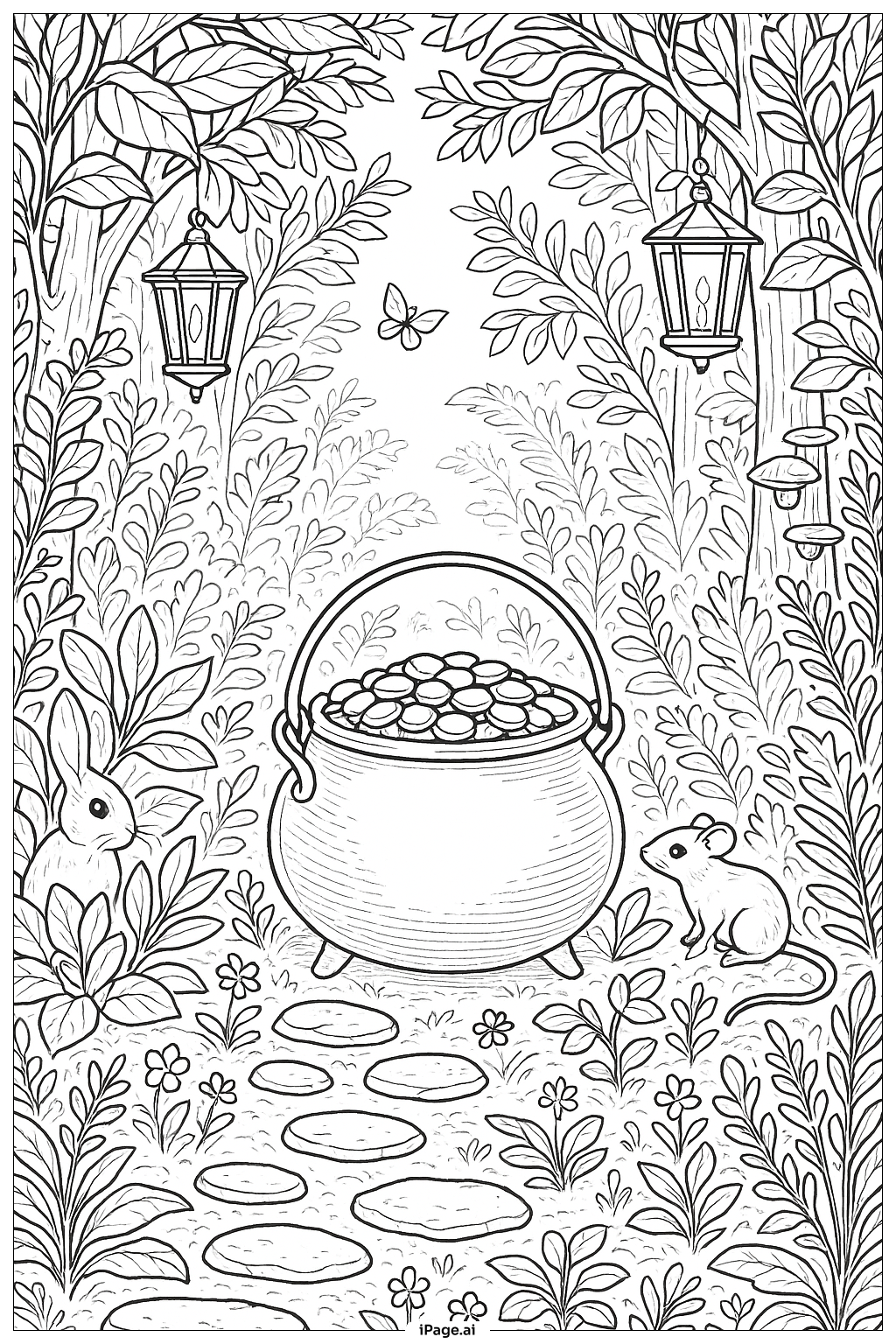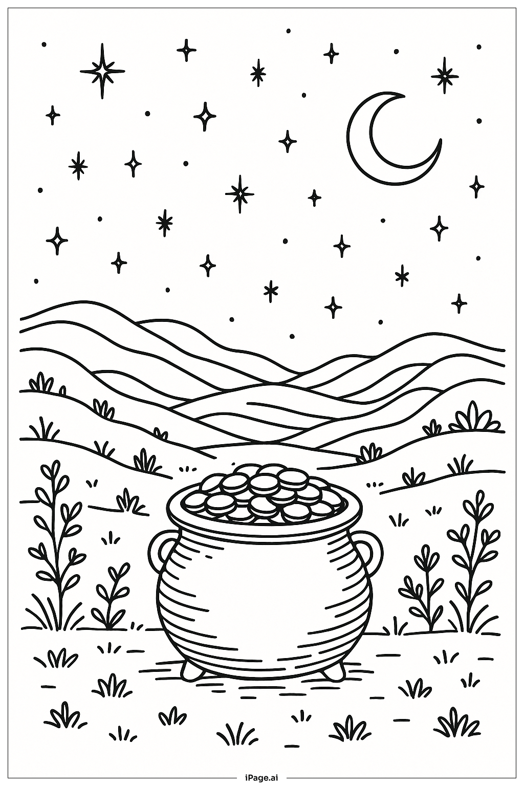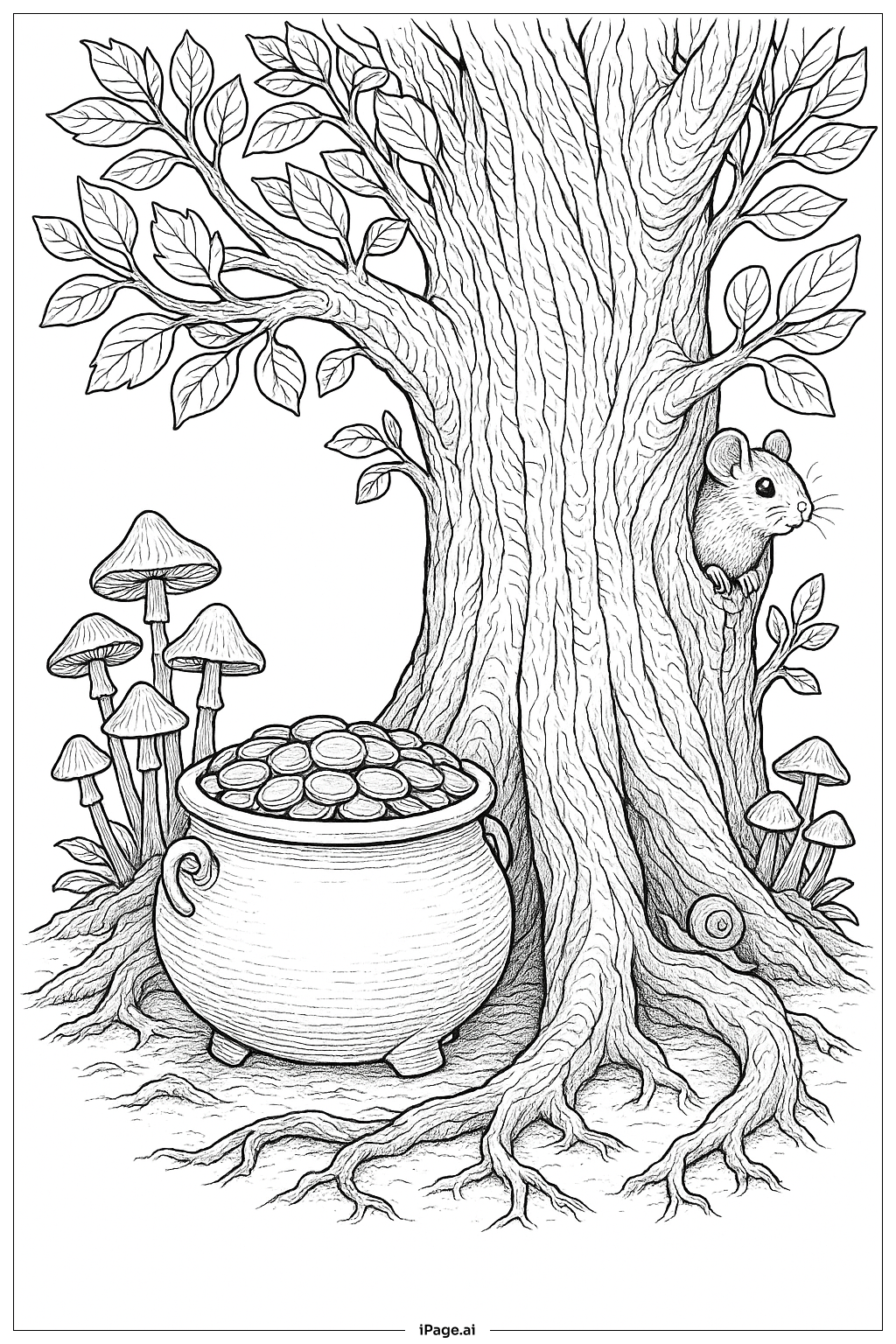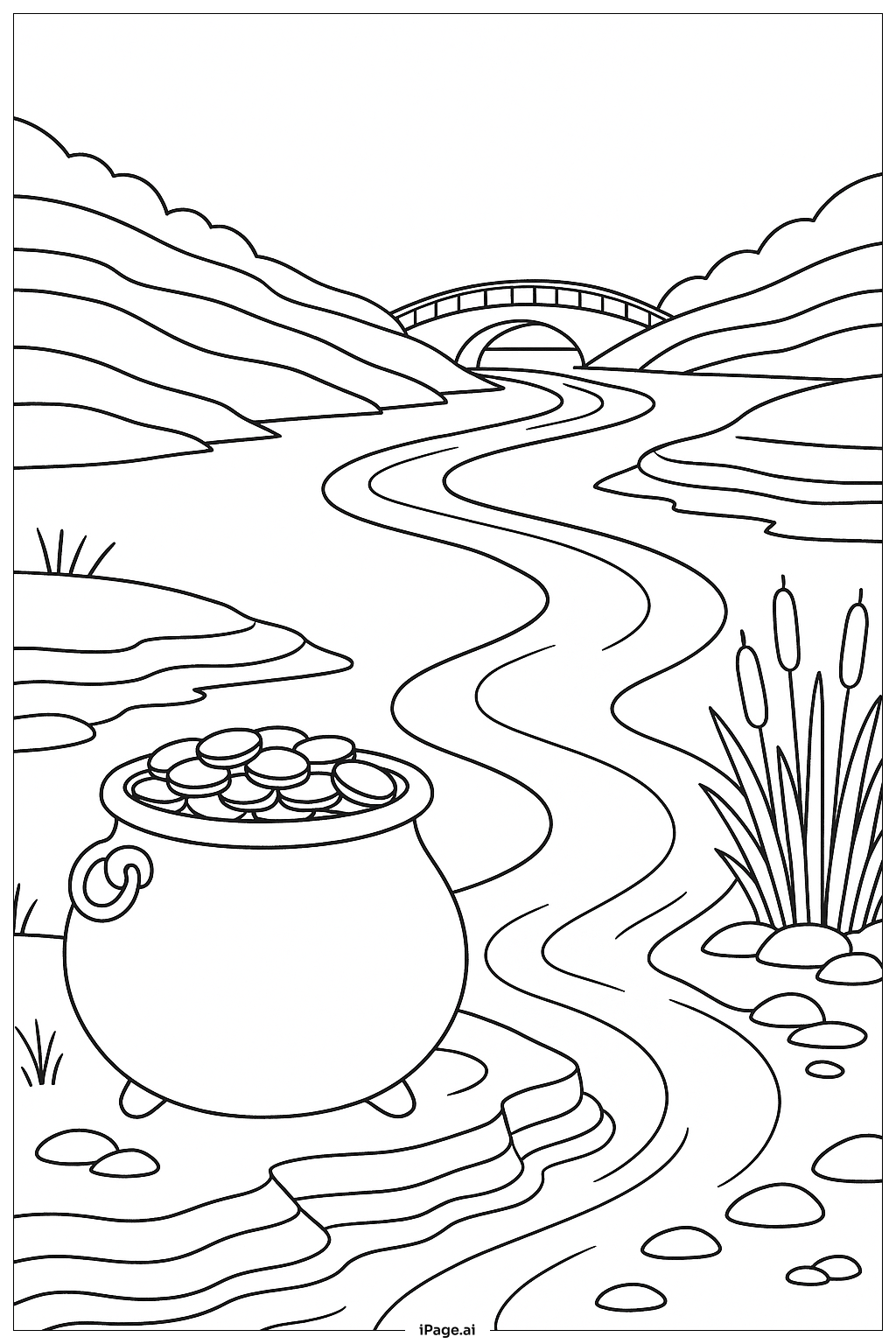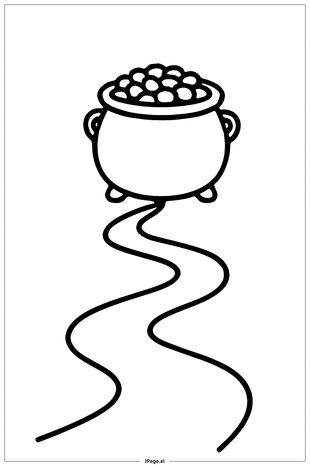
Coloring tips: How to color Pot Of Gold With Simple Path coloring page well?
Start with the pot itself. Use a deep black or dark charcoal for the cauldron body to give it a classic iron look. Add subtle gray highlights along the edges to show a shiny, rounded surface. For the coins spilling out of the top, use bright golden yellow and warm orange tones. You can add small touches of light yellow or white to make the coins look shiny and gleaming. For the path, try a warm sandy brown or tan. Use slightly darker brown on the edges to give it depth and a natural feel. The ground and hills around the pot can be colored in fresh greens — use a lighter green for sunlit areas and a deeper green for shadowed spots. If you want a magical touch, add a soft rainbow arc in the background using red, orange, yellow, green, blue, and purple. Keep the colors bright and cheerful to match the lucky, festive theme of a pot of gold.
Coloring challenges: Which parts are difficult to color and need attention for Pot Of Gold With Simple Path coloring page?
• Coloring the Pot's Curved Surface: The round, cauldron shape can be tricky to shade correctly. To make it look three-dimensional, you need to apply darker tones on the sides and lighter tones toward the center. Blending smoothly without creating harsh lines takes practice, especially for younger colorists.
• Making the Coins Look Shiny: The stack of coins at the top of the pot needs careful layering. Using only flat yellow will make them look dull. Adding highlights with a light yellow or white pencil, and shadows with orange or brown, helps each coin stand out. Getting that glowing, metallic effect is a real challenge for beginners.
• Staying Inside the Bold Outlines: Even though the outlines are thick and clear, small areas — like the individual coins or the curved rim of the pot — are tight spaces. Keeping color neatly inside these borders without going over requires a sharp pencil or a fine-tipped marker and a steady hand.
• Coloring the Winding Path Naturally: The path needs gradient coloring to look realistic. The center of the path should be lighter, fading to darker tones along the edges. Keeping this gradual shift consistent all along the curve of the path is harder than it first appears.
• Balancing the Overall Color Palette: Choosing colors that work well together across the whole image — from the dark pot, to the golden coins, to the green ground and sandy path — requires thinking about contrast and harmony. If the colors are too similar in brightness, the image can look flat and lose its visual appeal.
Benefits of coloring books: Advantages of drawing Pot Of Gold With Simple Path coloring page
Coloring this Pot Of Gold With Simple Path page offers a wonderful range of benefits for kids and young learners. First, it helps build fine motor skills. Carefully filling in the pot, coins, and path strengthens hand muscles and improves pencil control — skills that are directly useful in writing and drawing. Second, it encourages color recognition and creative thinking. Deciding which shades of gold, green, and brown look best together helps children develop their artistic eye and confidence in making creative choices. Third, the winding path element introduces simple concepts of perspective and spatial awareness in a fun, low-pressure way. Tracing the path visually from start to finish also supports early understanding of direction and sequence. Fourth, completing the image gives a strong sense of accomplishment. Finishing a coloring page — especially one with several different elements — boosts self-esteem and encourages kids to take on new challenges. Finally, the lucky, treasure-themed subject matter sparks imagination and storytelling. Kids may start imagining who left the gold, where the path leads, or what adventure comes next, making this a great starting point for creative play and conversation.